Welcome to Parrot Chocolatiers! We are committed to producing high quality chocolate, containing the richest flavor. We use 100% fair trade cocoa. We are dedicated to spreading awareness about the working and living conditions sin developing countries that harvest chocolate! Now if you look below you can note the strengths and weaknesses of brands that could not give a fly care about well being of people.
Lets face the facts, Reese’s peanut butter cups are delicious, there is just no denying that, but did you also know that every peanut butter cup have the tears of a young child. Food for thought. Some of Reese’s strengths are that they make a delicious product, and also have a pretty slick website that is pleasing to the eye. Though some of their weaknesses are that you cant eat more than like 25 of their peanut butter cups without wanting to throw up, trust me, and that their logo is just their name and that pretty lame, and their colour scheme, though iconic, is kind of gross.
Now nestle is the biggest scam you could ever fall for. Just looking at their website shows they are having a mid life identity crisis. You can tell that they are liar’s based on how their website is trying to sell chocolate for to the valentines day, the super bowl and brag about the quality of their ingredients. That’s something we at Parrot Chocolatiers can just not stand for. Pick a lane Nestle, pick a lane. Nestles strength lies in its large market share and brand identity, because when you think of chocolate bar or snack, you are probably thinking of a nestle product. Which is fine, because all of their products are delicious, but then again how could they not be. Their weaknesses include a website that, though looks up to date for web design standards, just is not working for me. Also their logo is a bunch of birds in a nest, and that’s just gross, who would ever let a bird near chocolate? Don’t they have diseases or something that can spread easily to the chocolate? I don’t know, that’s just messed up, and us at Parrot Chocolatiers will just not stand for it.
Though these two famous brands have inspired our own logo! Though the magic of Nestle birds in a nest, and the craziness that is Reese’s colour scheme, I present to you, our logo!
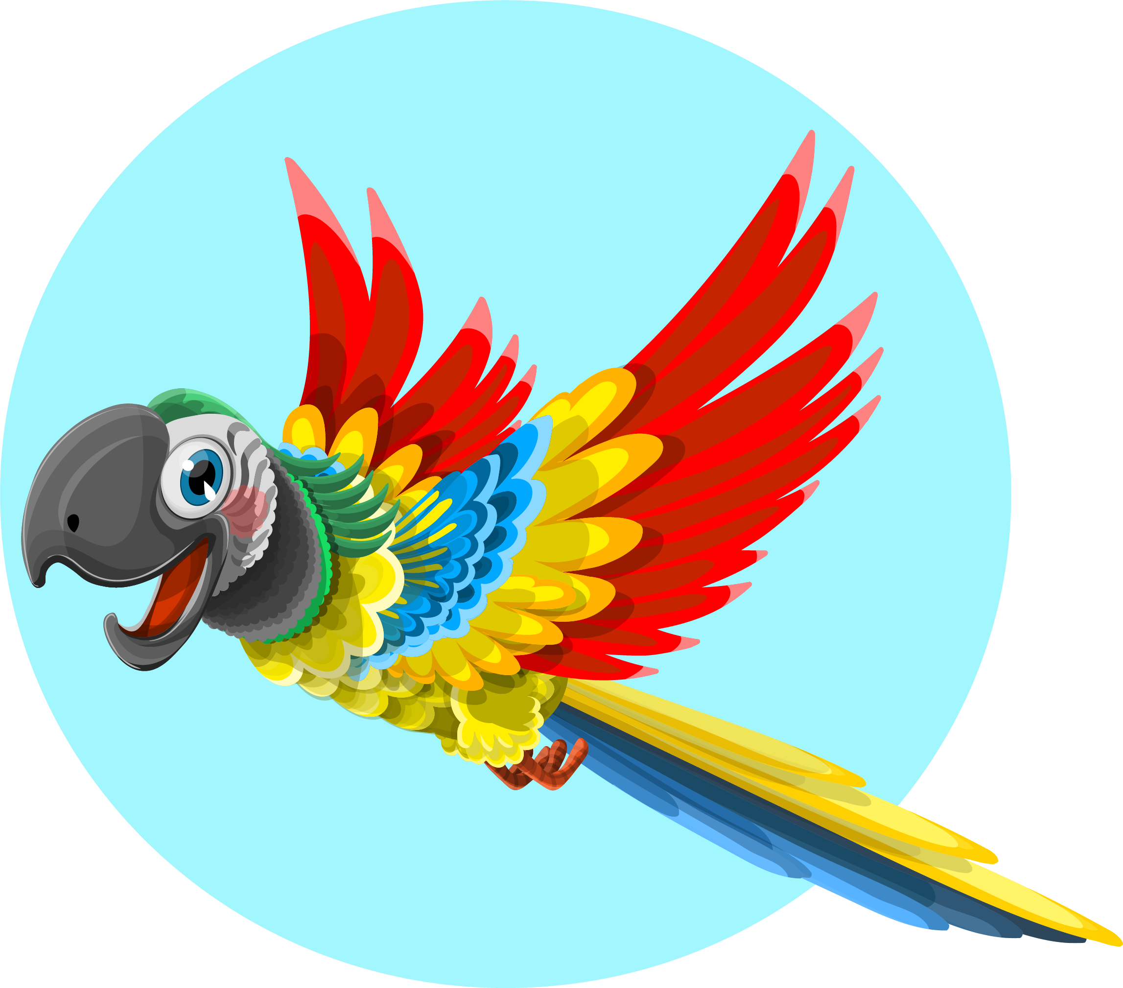
I don’t say masterpiece often, but lord have mercy. This is the best of both worlds. Birds in your chocolate and wild colours, just like our forefathers, Nestle and Reese’s taught us. This logo shows what our company is about in many ways. First, it represents two out of the three main colours of the company, since I was instructed to save the red for the website design, I think this turned out well. Also, the image is pretty straight forward and can be taken in two ways. The first way is that the chocolate bar is a bird, or that there is bird as such a pure ingredient in the chocolate, it still has a tail in the final product. Thus showing off the colours, the chocolate and the bird.
The logo is effective for the brand because it makes people think about the ethical issues that come out of the chocolate industry. Real talk, its pretty terrible. But not to get into any real world sad things, our logo is though provoking, and that’s important.
Obviously the logo is created is the parrots tail feathers coming out of the chocolate, but did you know it was originally based on the parrot image about it!? Not going to lie, I spent to much time trying to figure out how to make that stupid logo, and I still could not get the black feathers to turn red. But so is life I guess, just a recipe for sadness. But yes, this logo will fully stand out against our competitors because it takes what they did and makes it better. Mic drop.