NOTE: The little square beside the logo is what the colours of the candy is supposed to be, I just had an issue with editing it in illustrator. please forgive.
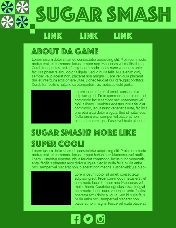
Im going to be real guys, I do not want to write this paragraphs, but you know what, I am going to just keep trucking on through it. I choose these colours because its a video game thing, so I think of a classic gameboy thing, which was mostly all this gross green colour. since its monochrome it has various saturatuns and lightnesses of one colour, in this case its the green. Green is a secondary colour, so its not as calming as primiary colours, but green makes people feel calm so I sam sure growth and feel peaceful and healthy. I trust the green and feel peaceful because of the natalga or some bullcrap like that

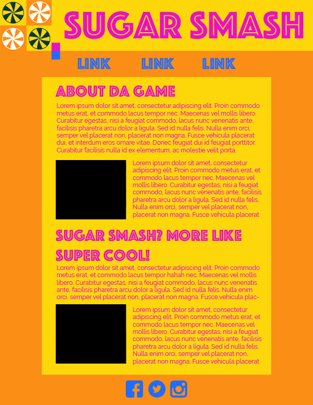
still jsut trucking through - I like th eanalogus colours because you get a shit ton of different colours and they all look cool and bright, which is why I choose this. Since the website is predominatly orange and yellow which provides the user with optimism friendlyness clarity, cheerfulness, warmth and confidence, dont you think? I dont think this looks very good but I really hope you guys take pitty on me, because I dont think the accent colours look good, like what the heck is that supposed to be? who would every use it the way I did? a child, thats who, a child.

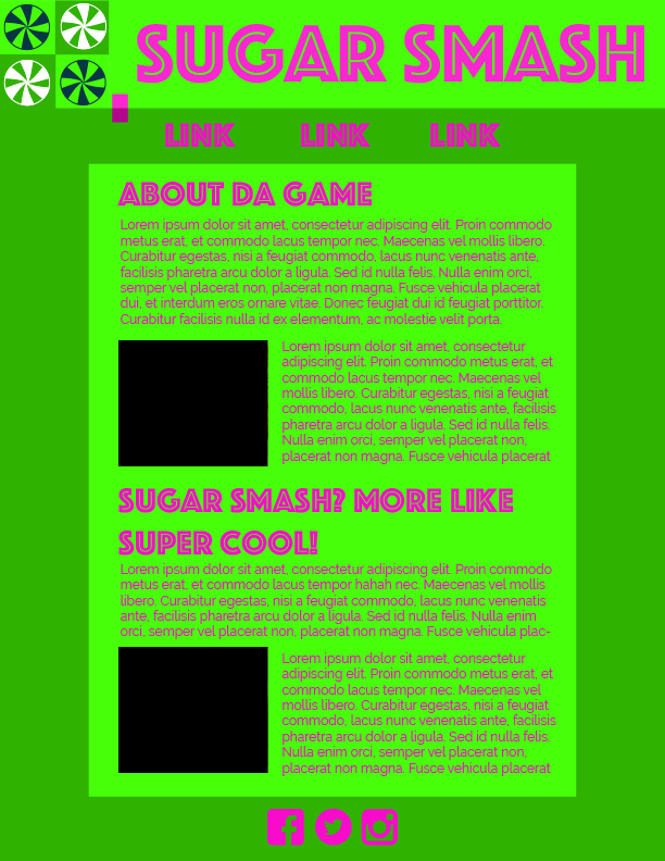
FINALLY lets finish this comlimentary ting and get the heck out of here shall we? complimentay colours are nice becasue they look good together, I call this website my barny website because o the green and purple btu it looks good. Again, the green make the website feel peaceful and healthy, and makes you grow or something, thogh the terrifyingly bright neon purple makes people feel like they are creative, but i really doubt it to be honest. Anyways please give me a good mark and I love ya guys < 3